Context
Platables makes homemade customized dogfood and was looking to break into the healthy and customized dog food market.
Me and a former colleague of mine were brought on board to work with their marketing and branding team to incorporate the brand ethos and story on their website and the shopping experience on it.The client had a prototype and a product at this stage and the marketing and visual design was in development.
Assessing project status
After the initial meeting with the client, the current status of the project was mapped. We had three takeaways regarding the completion status of key aspects
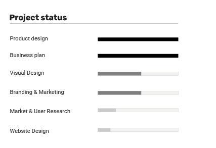
- There is a dearth of user research
- Marketing and branding is in its early stages and needs time to develop.
- Client has well defined constraints imposed by their business plan and operations.
Designing a suitable process
The initial phase of the process consisted of exploratory research - we worked with the marketing team and focus groups to conduct market and user research to identify opportunity areas in the project where user experience could be optimized.
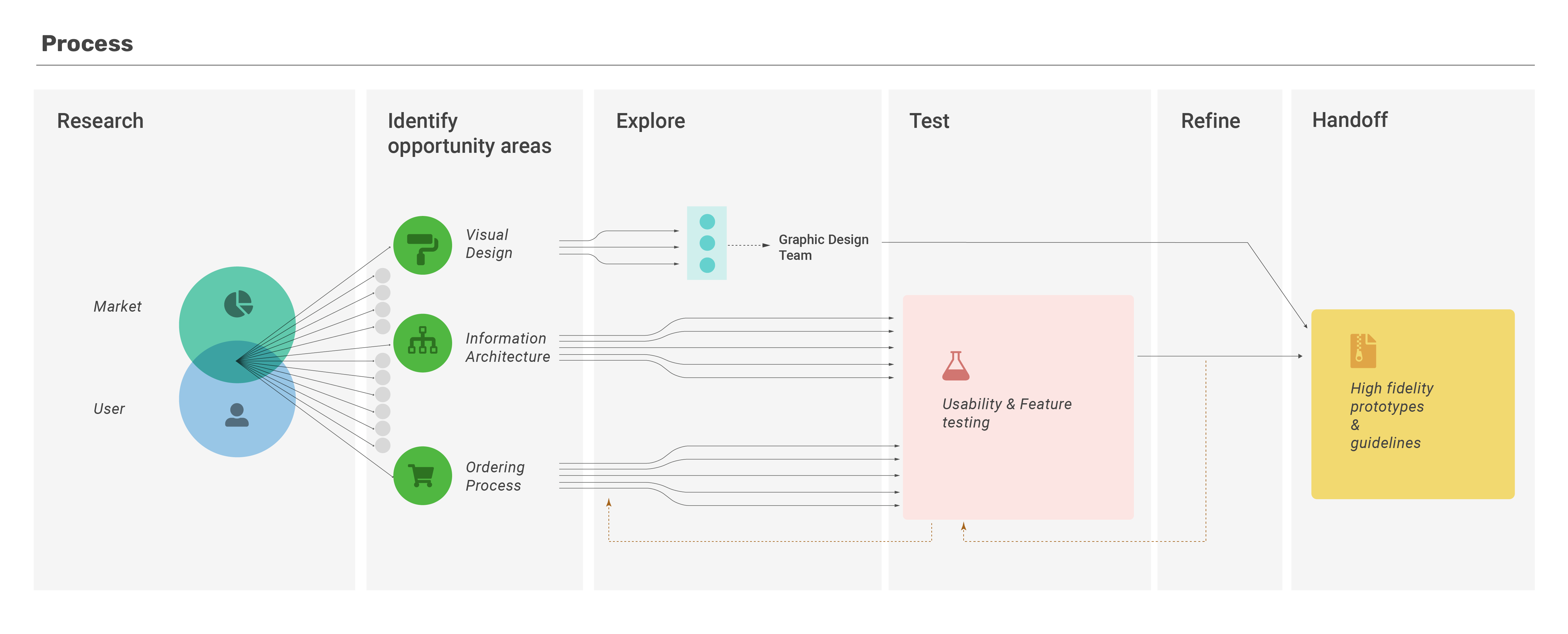
Once we had the identified the most promising opportunity areas,the scope of the intervention was decided based on the impact, effort and constraints. Solutions were created to simplify the website architecture and ordering process and align the visual design to the brand story were created and iterated on, informed by regular testing with the focus group.
Our involvement with the project ended at this phase with us handing off the design guidelines and assets to the client for development.
Research
The client had a clear idea about what market segment they were targeting. The issue was, there were already other players in the segment using a similar line of approach - that of healthy dog food. We identified the key competitors and conducted a study to identify how they implemented their brand story into their informational content and shopping experience.
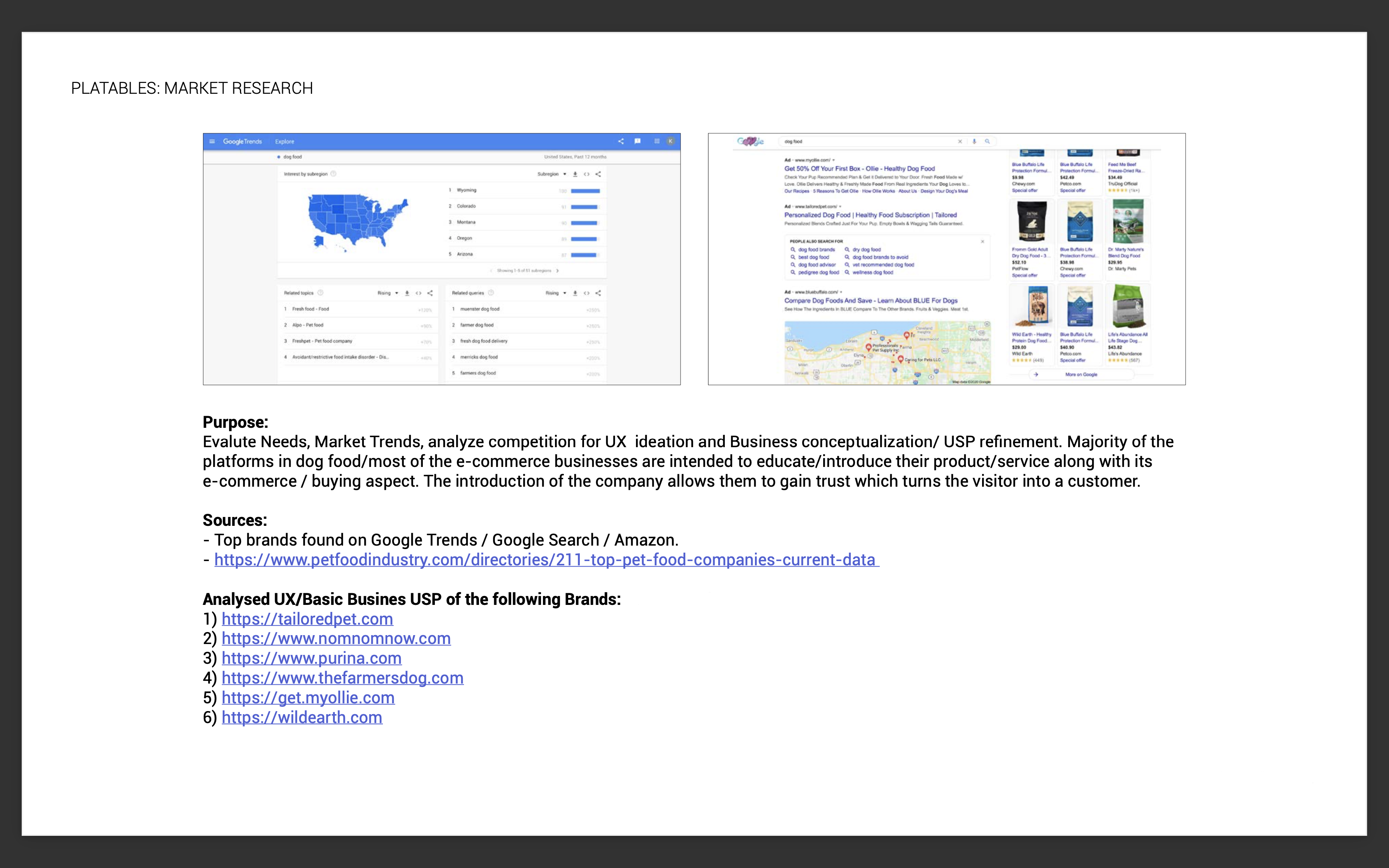

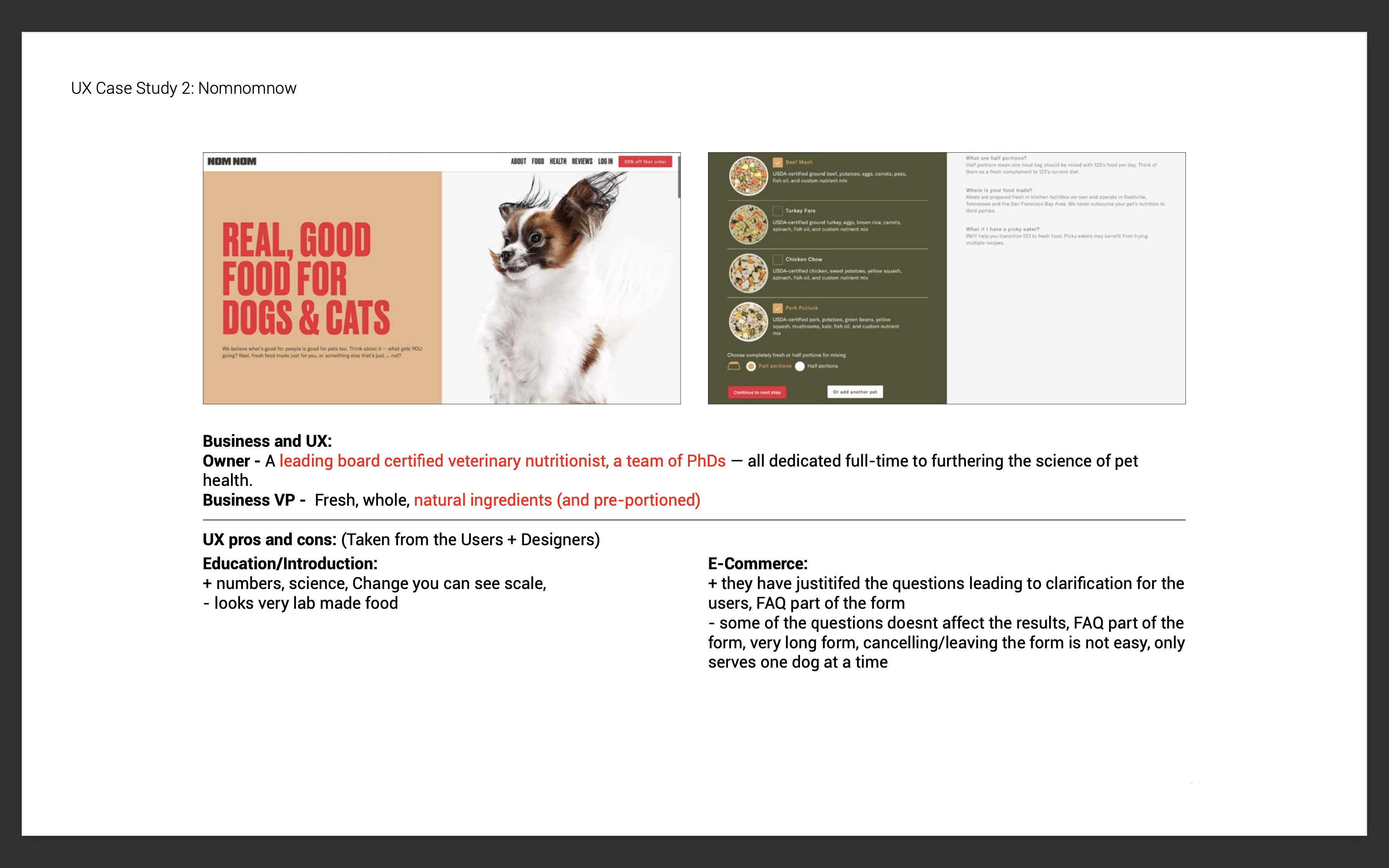
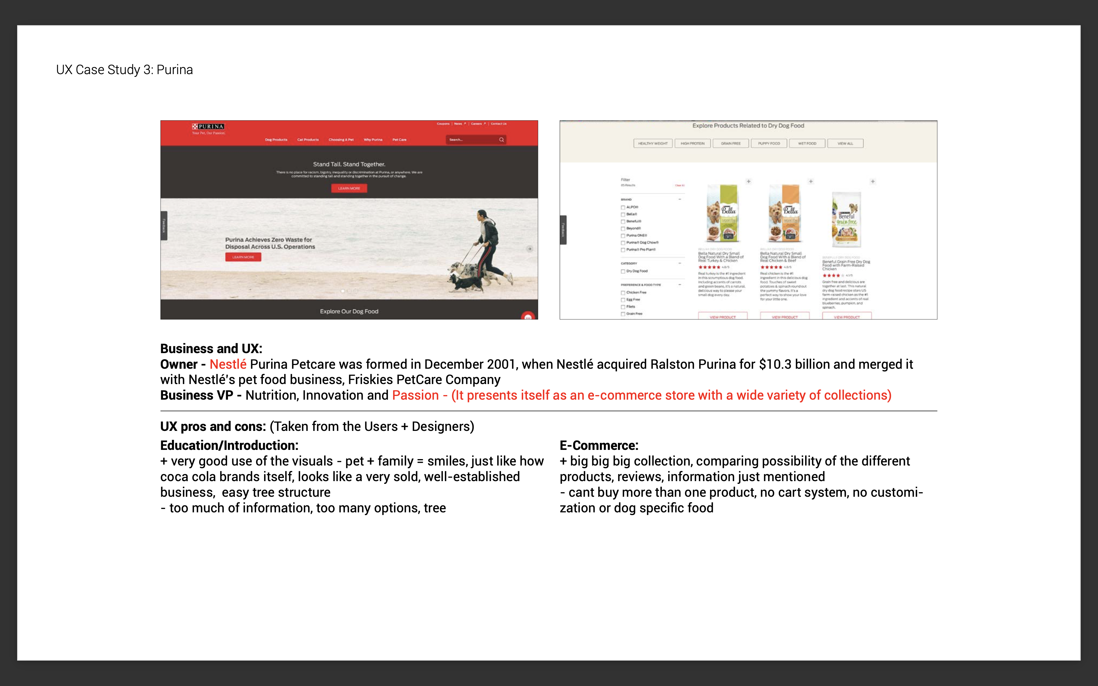
Focus groups were recruited by the client to be representative of their consumer base. We wanted to understand what the consumer’s expectations from a brand in this segment were and what they associated with the idea of healthy dog food. We also wanted to study how the consumers structured the information and actions on the website.
We saw that there was an overlap in the gap in the market and an aspect of the client’s brand story and that translating it into the visual design and storytelling on the website, would be a route worth exploring. Over 95% of the consumers saw their dogs as family and wanted to able to take care of their dietary needs as such. None of the brands in the market at the time had a tone or consumer experience that aligned with this.
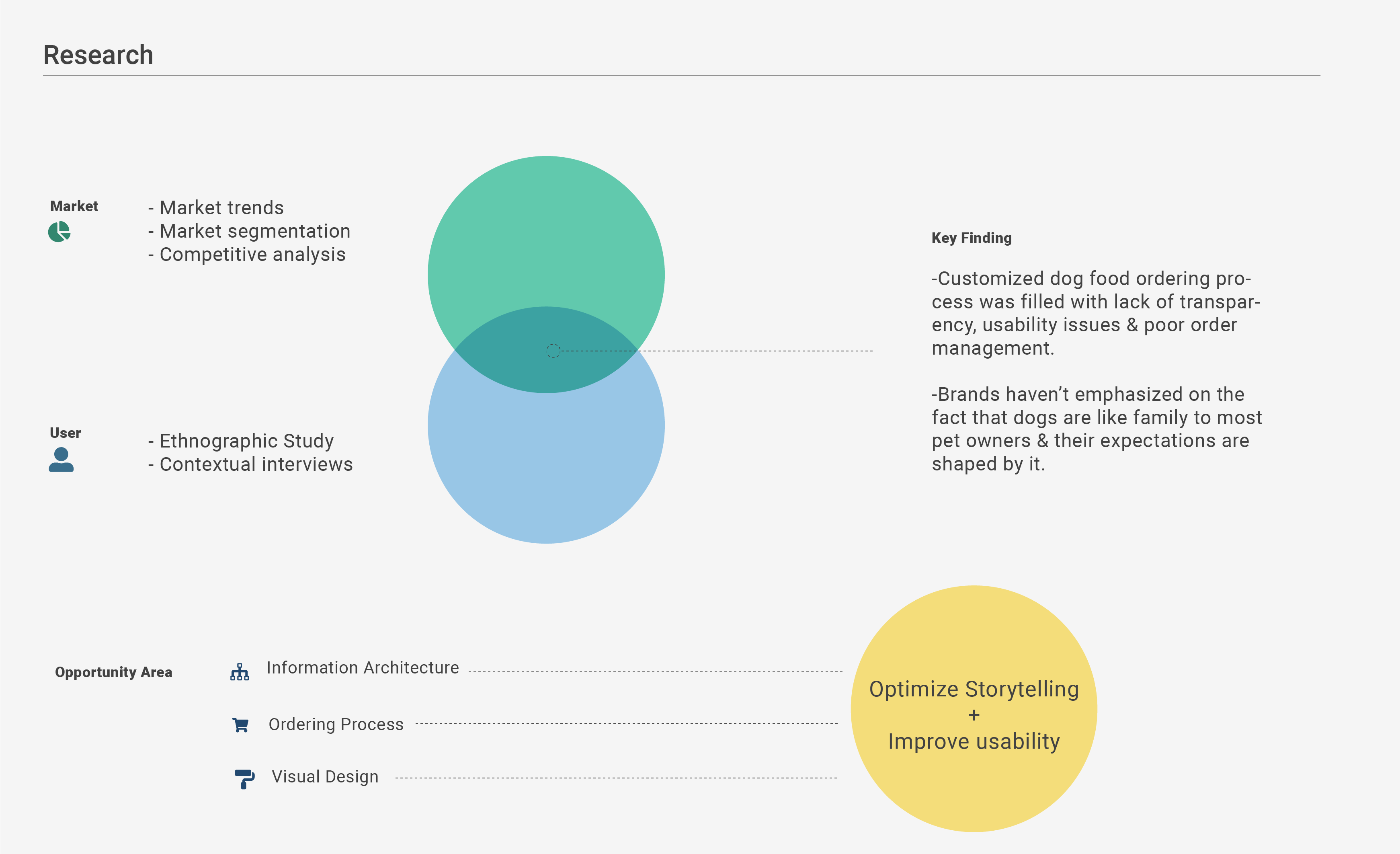
Competitor ordering processes also contained factors that the pet owners saw as adding to opacity and difficulty in addressing the dietary needs of their pets . The insights also revealed what features that the client website was lacking & helped us categorize them into ‘must-have’ and ‘nice-to-have’ types of features.
Prototyping and Testing
In consultation with the client, we then defined the scope of the issues that we would be addressing. Since the client had an in house marketing and visual design team , we decided to limit the scope of our involvement in the UI aspect of the website to providing the visual design team with a brief, references and guidelines. We focused on creating, testing and refining the information architecture and workflow involved in purchasing the product, and handed off high fidelity mockups for development.
Information Architecture
The information architecture of the website was made and refined based on the results of card sorting and A/B testing.
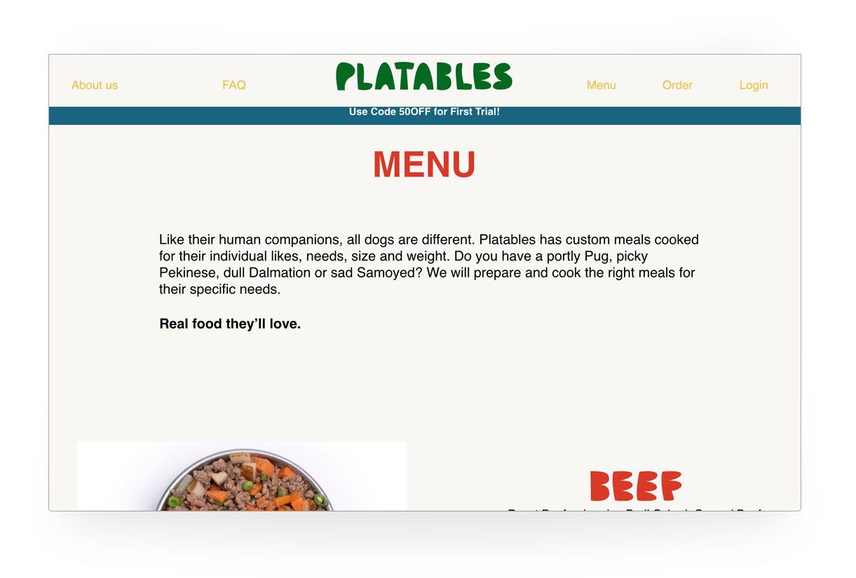
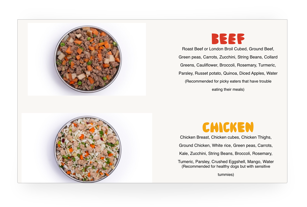
We restructured the current website to provide easier access to shopping and information on the ingredients, and added sections to customer profiles that aided in managing and tracking their pets health and diet.
This allowed the returning customers to make more informed choices for future orders.
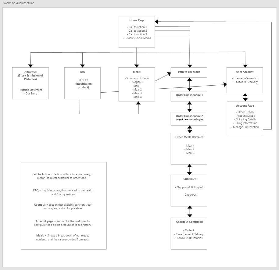
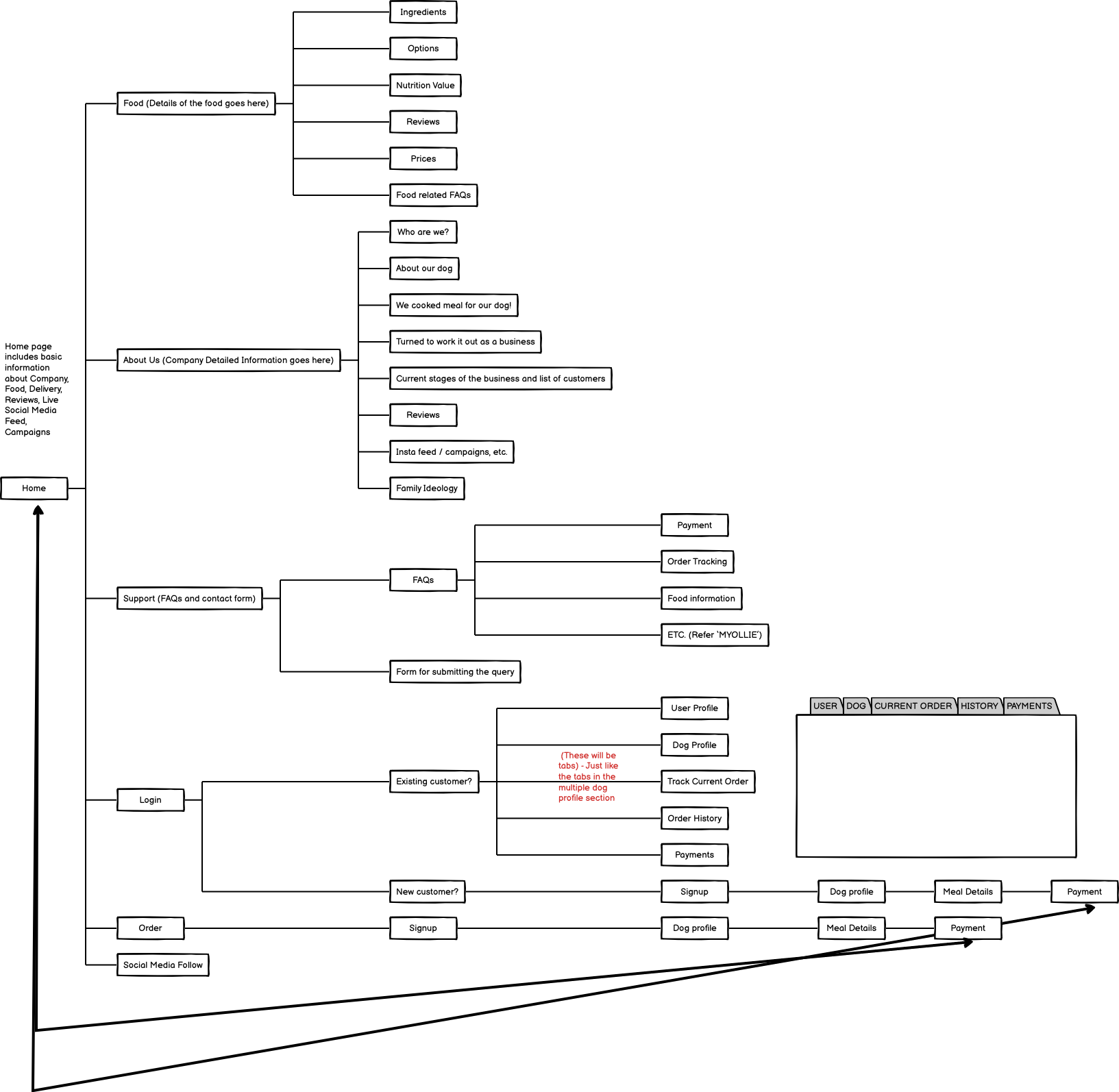
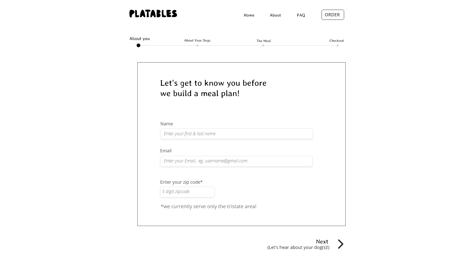
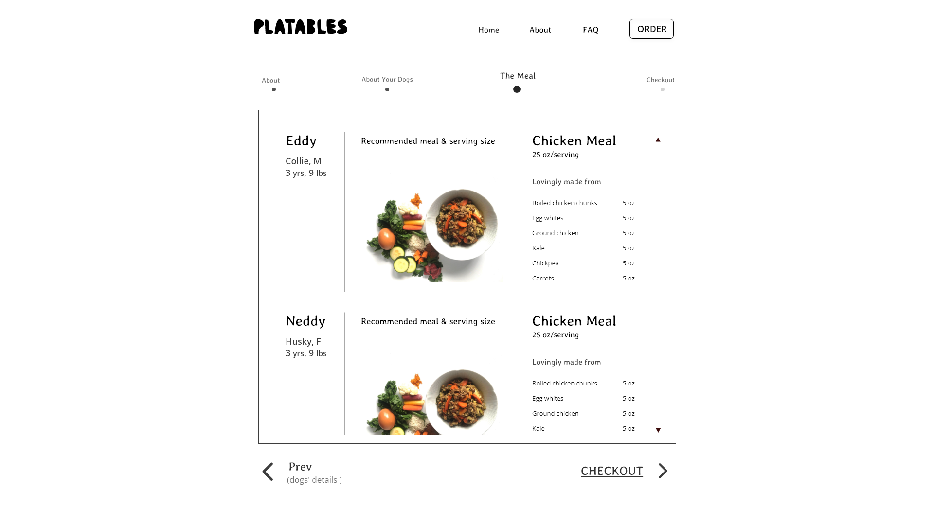
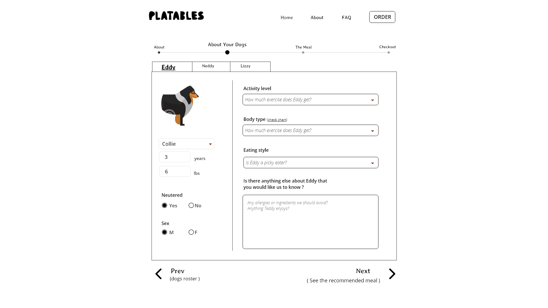
We also structured the shopping process to accomodate customers address the needs of multiple pets and their specific needs while informing them of how the product suggestions were made. This allowed us to directly address and categorize the needs of each individual pet that the customer had, instead of burdening the customer with the task of managing this on their own.
Visual Design
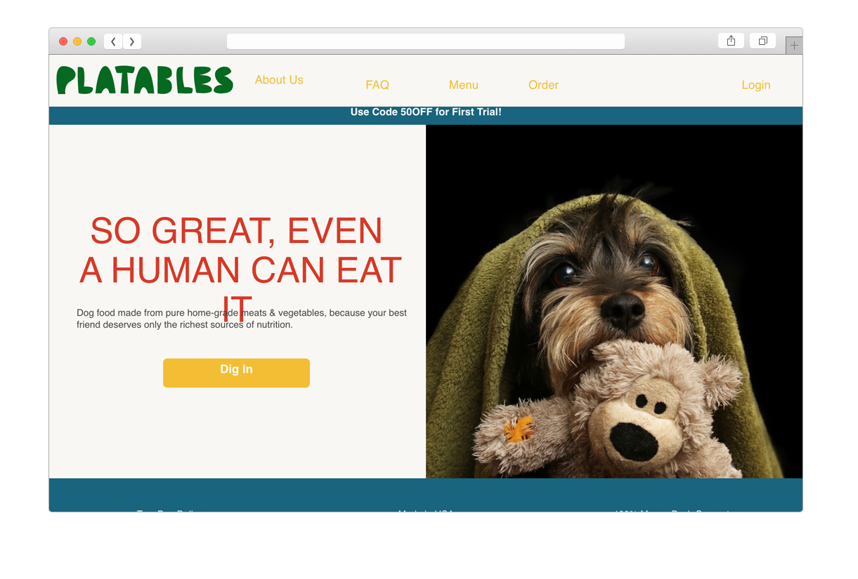
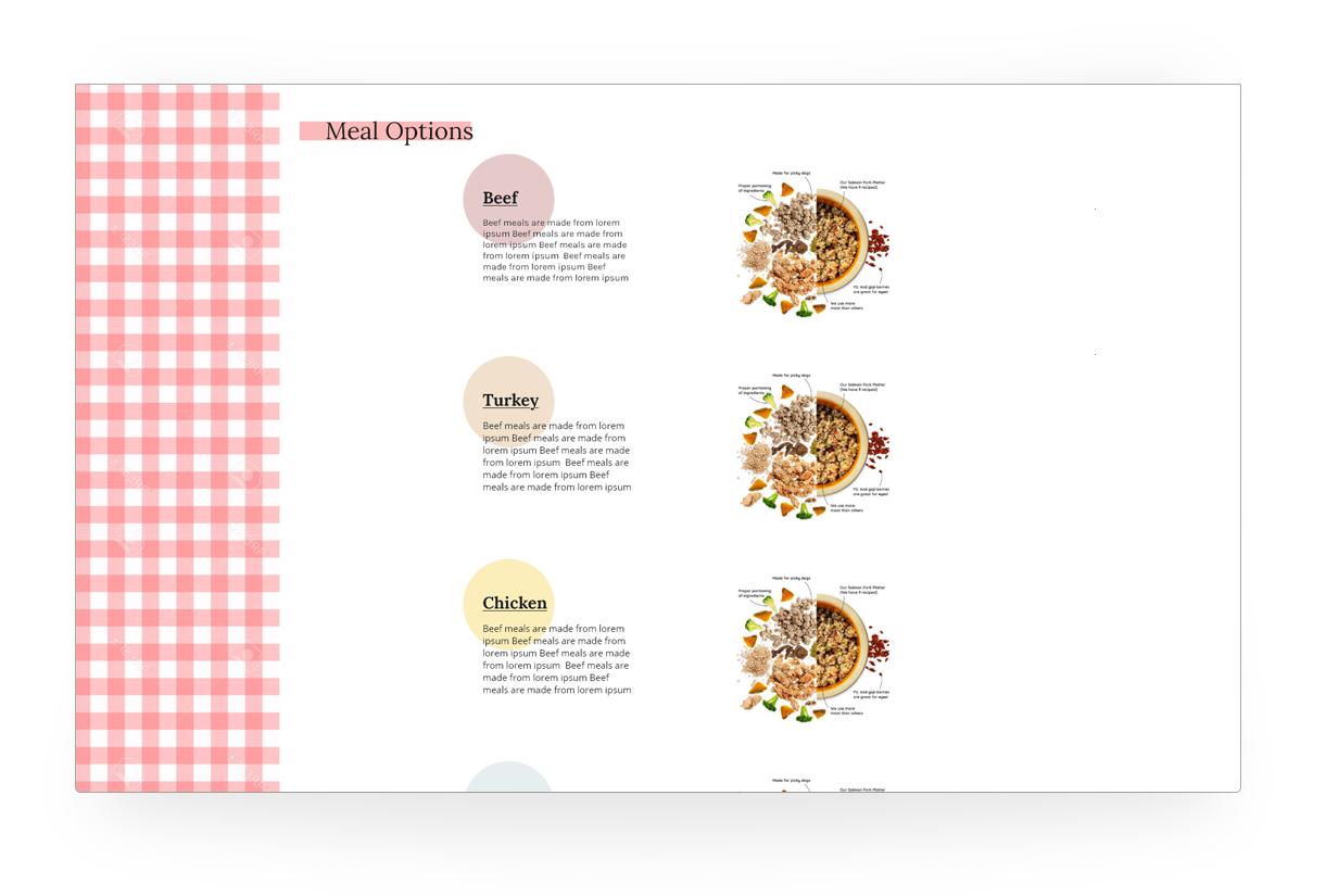
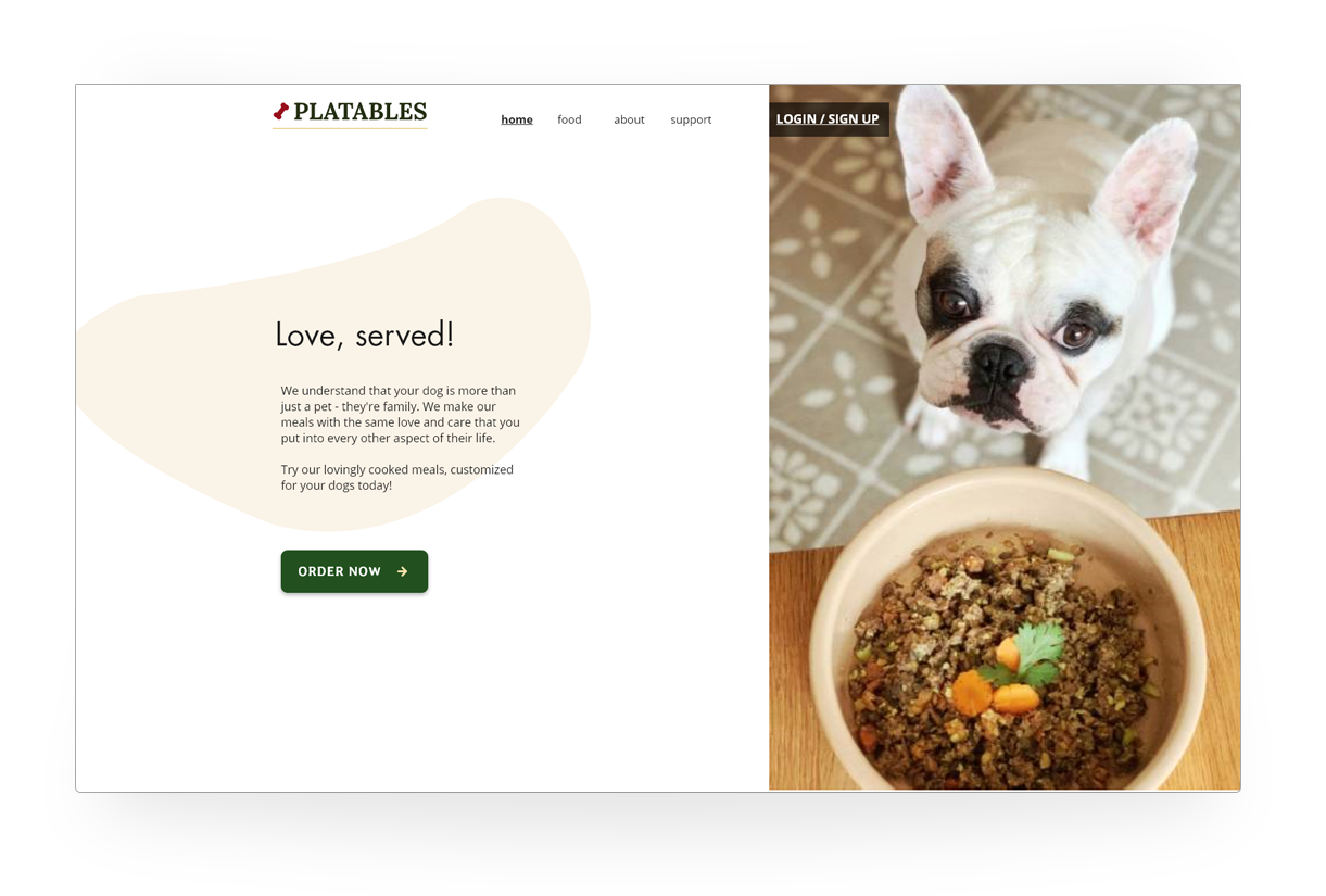
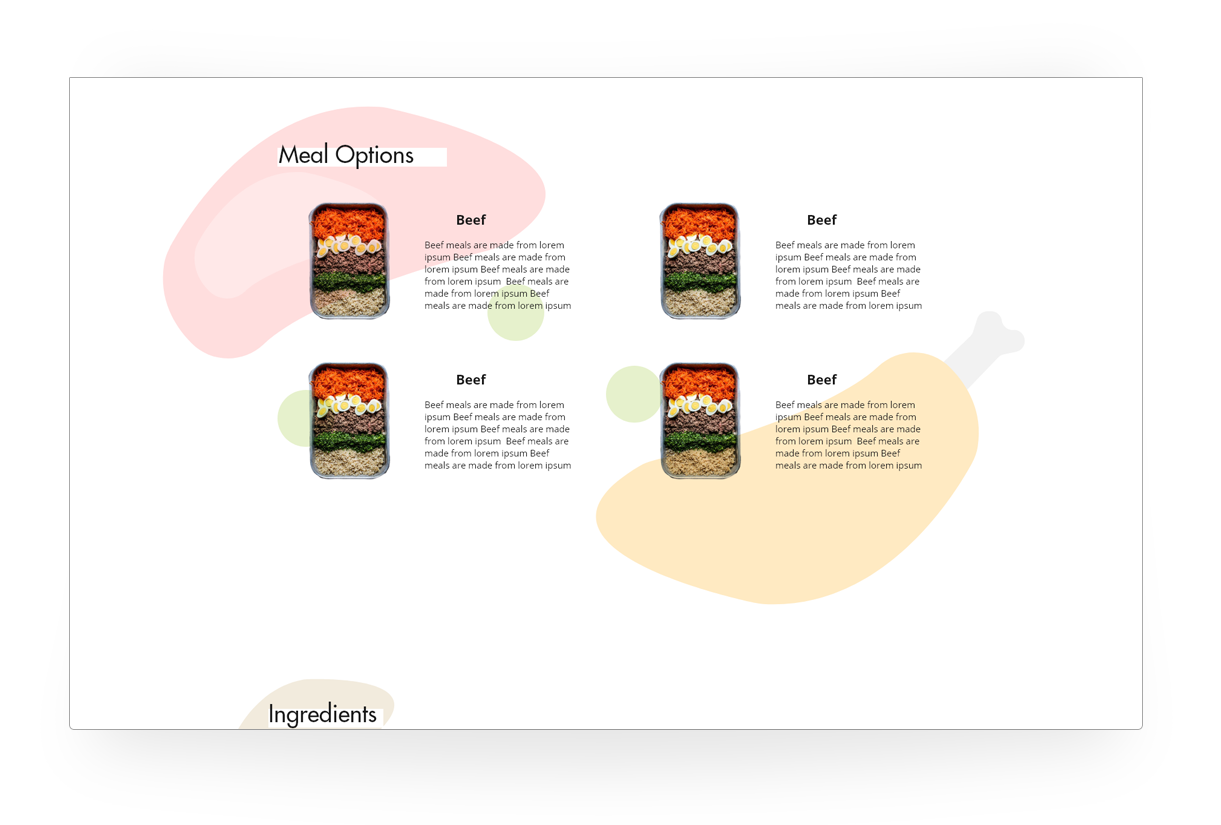
A few directions were tested with the focus groups before picking one to refine and work with. We tried variations in visual language that focused on the themes of a home kitchen, healthy ingredients and caregiving in a family as guided by the brand voice as it evolved.
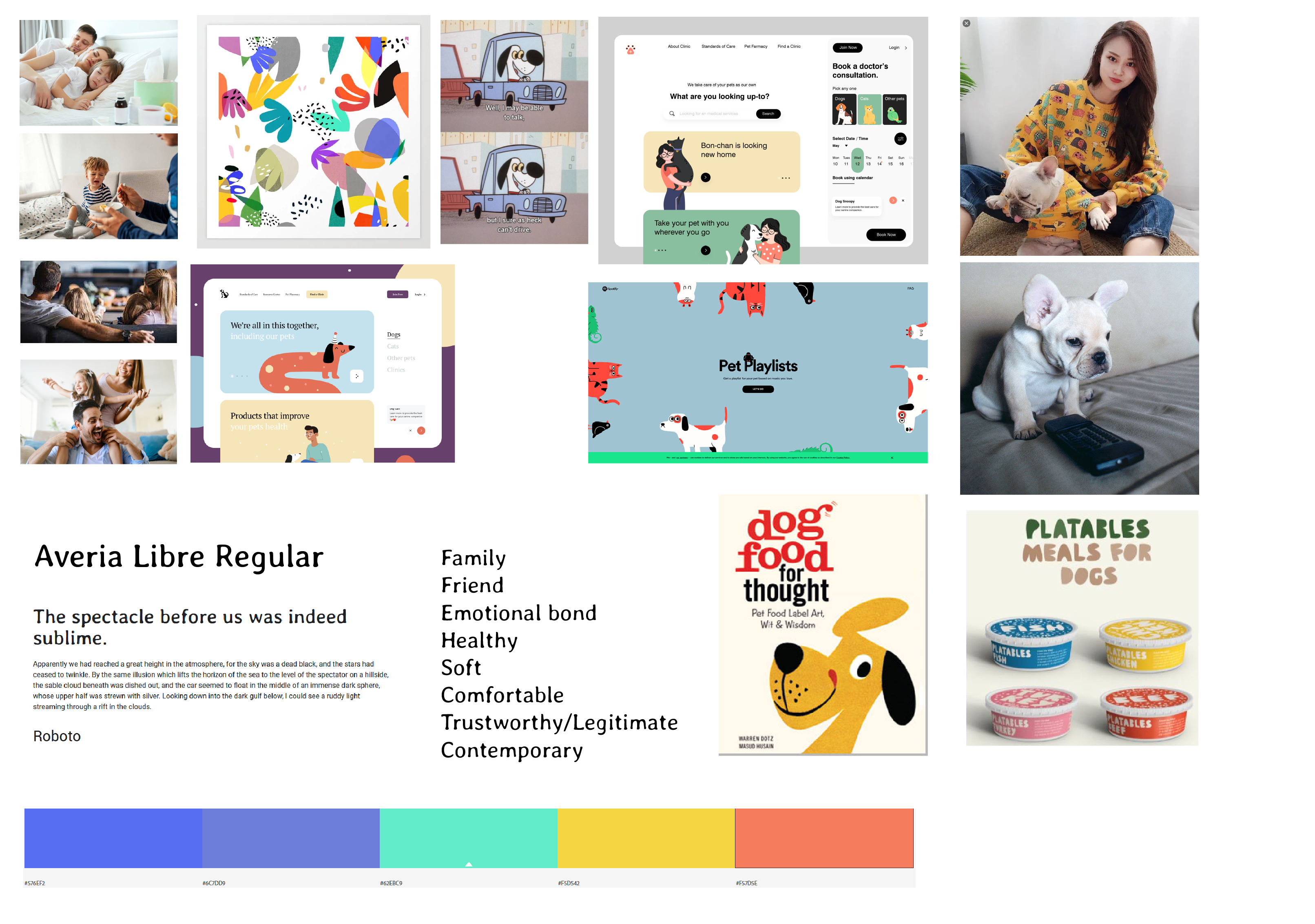
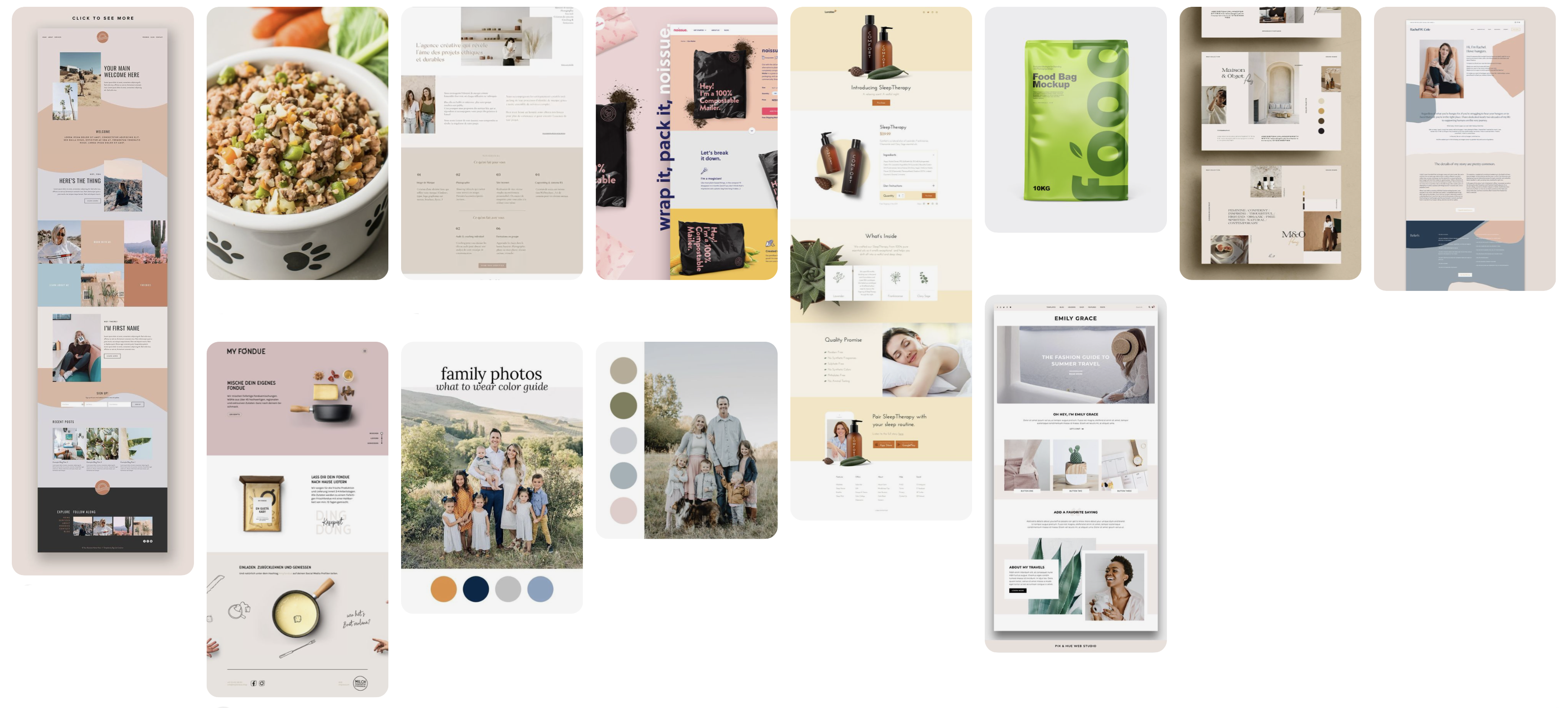
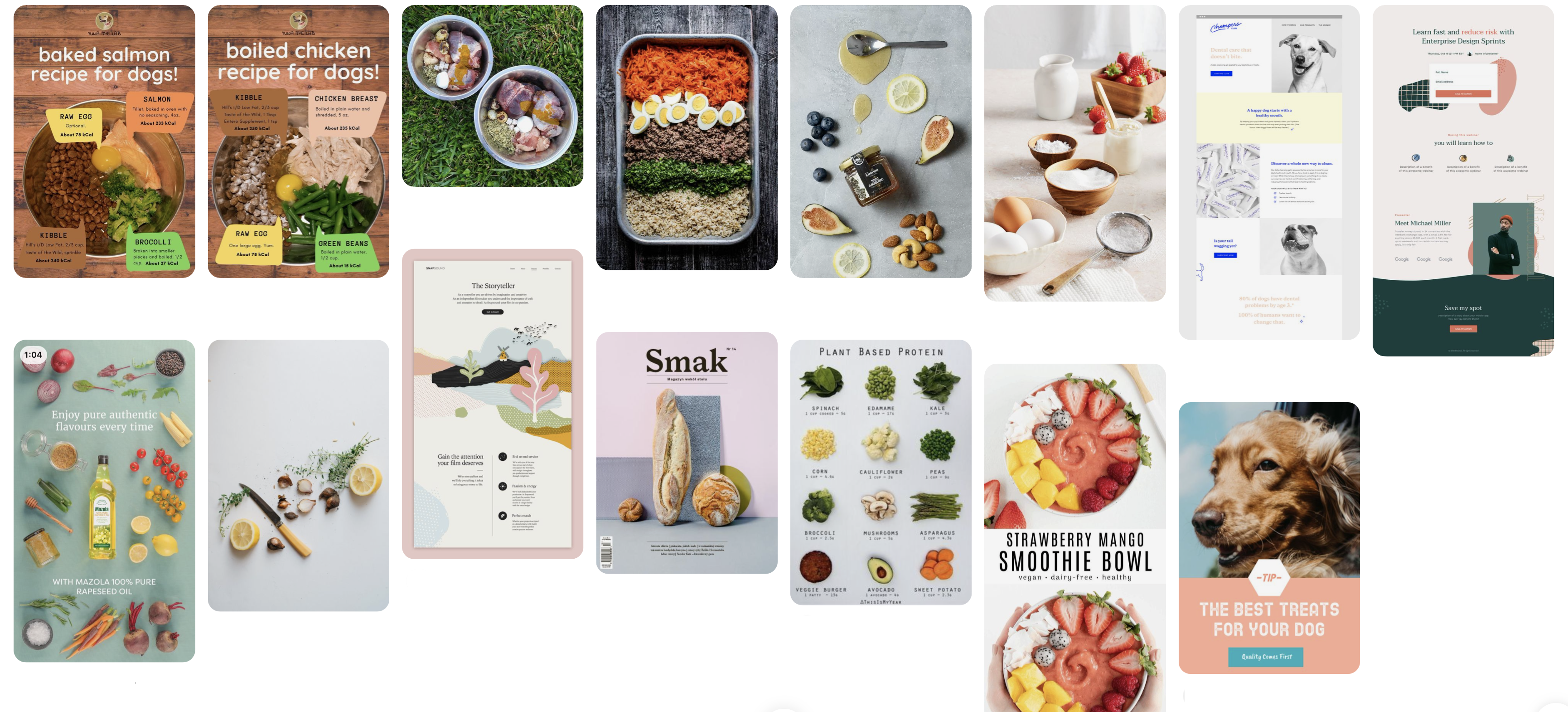
Mockups were tested as the brand voice developed by the marketing & graphic design team took on a more definitive form. Mockups were structured using the information architecture that had been tested and refined earlier.
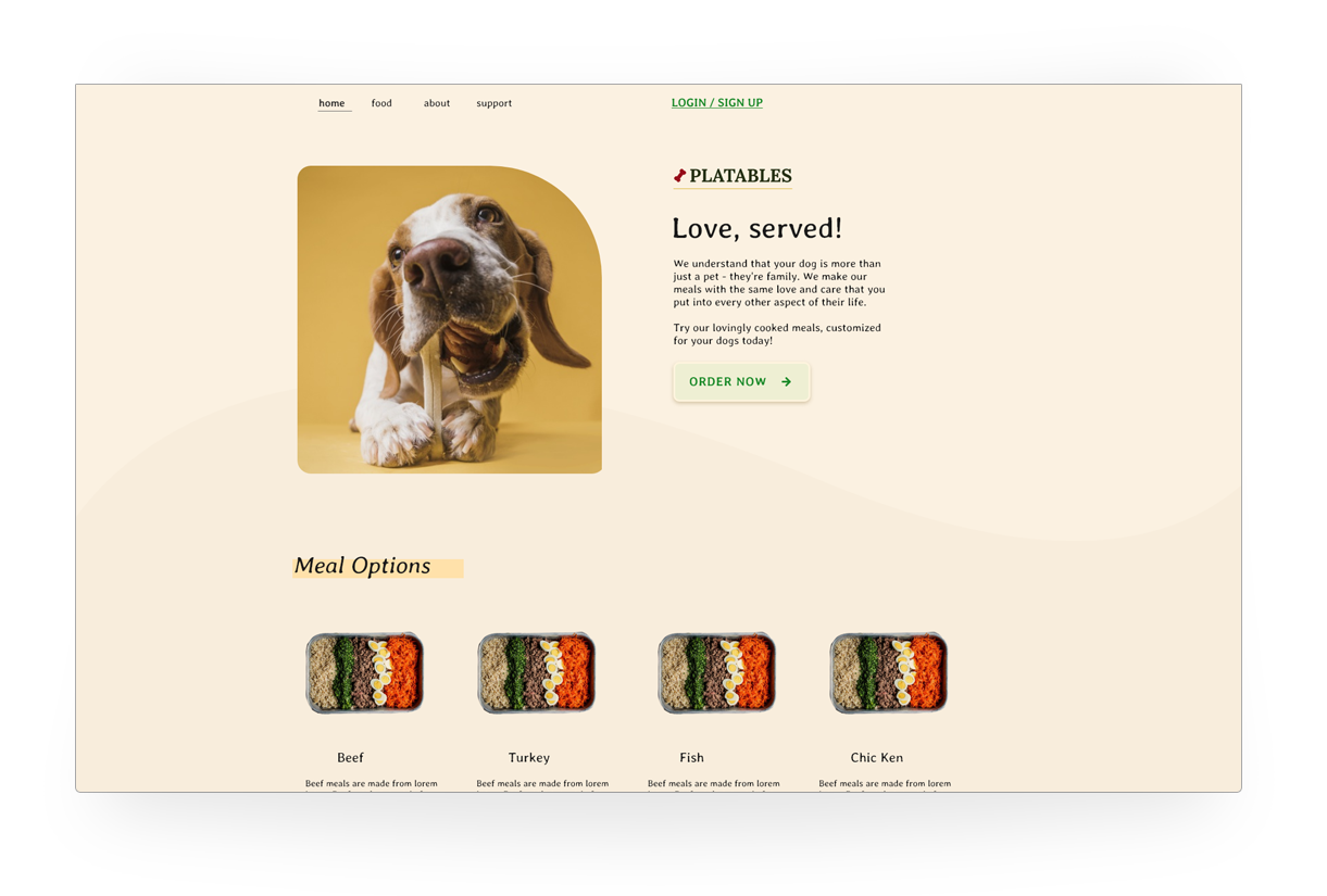
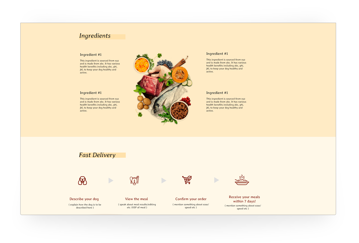
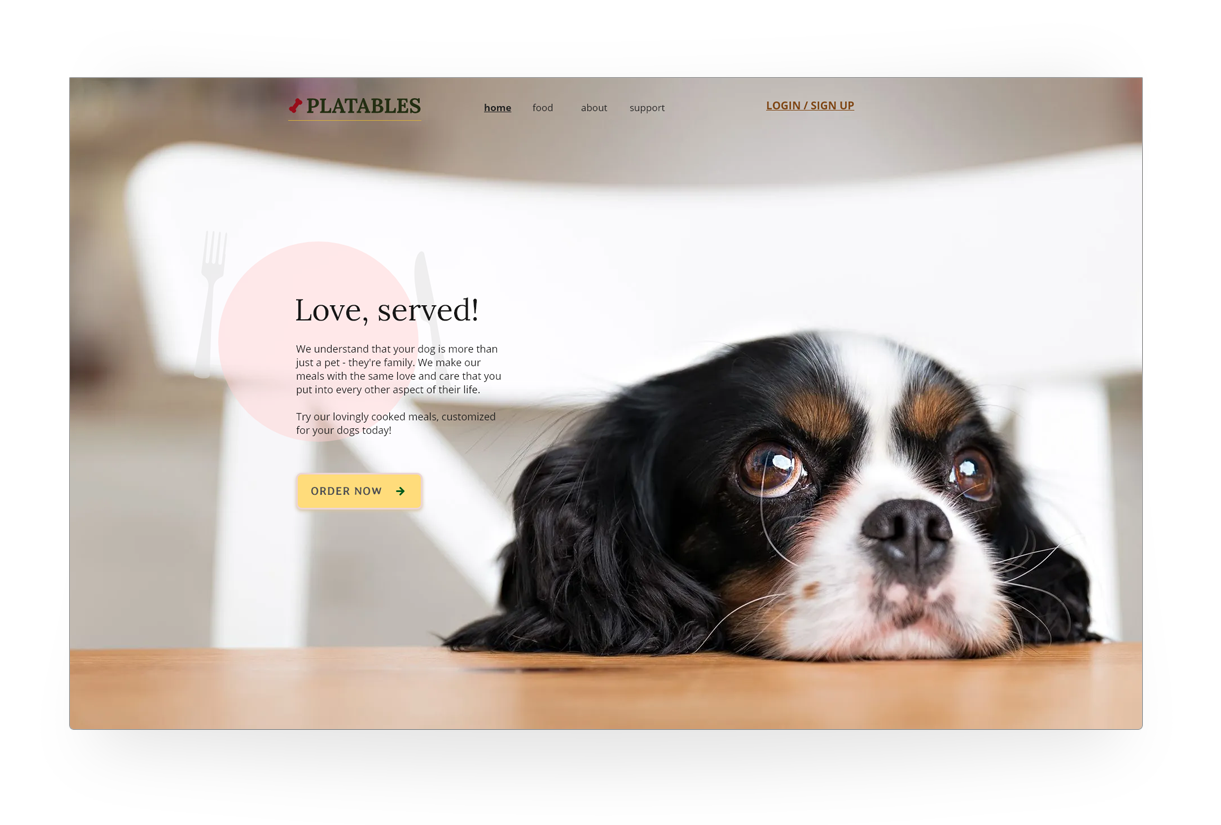
Handoff and Learning
Our involvement with the project ended at this phase as the client continued refinement of the copy and visual design. At the end of 3 weeks, the client was able to transition from having a product and website infrastructure to a website design and guidelines for making the experience pleasant and useful to the consumer.